Improving your designs with tactics instead of talent.
Every web developer inevitably runs into situations where they need to make visual design decisions, whether they like it or not.
Maybe the company you work for doesn’t have a full-time designer and you need to implement the UI for a new feature on your own. Or maybe you’re hacking on a side-project and you want it to look better than yet-another-Bootstrap-site.
It’s easy to throw your hands up and say, “I’ll never be able to make this look good, I’m not an artist!” but it turns out there are a ton of tricks you can use to level up your work that don’t require a background in graphic design.
Here are seven simple ideas you can use to improve your designs today.
1. Use color and weight to create hierarchy instead of size

A common mistake when styling UI text is relying too much on font size to control your hierarchy.
“Is this text important? Let’s make it bigger.”
“Is this text secondary? Let’s make it smaller.”
Instead of leaving all of the heavy lifting to font size alone, try using color or font weight to do the same job.
“Is this text important? Let’s make it bolder.”
“Is this text secondary? Let’s use a lighter color.”
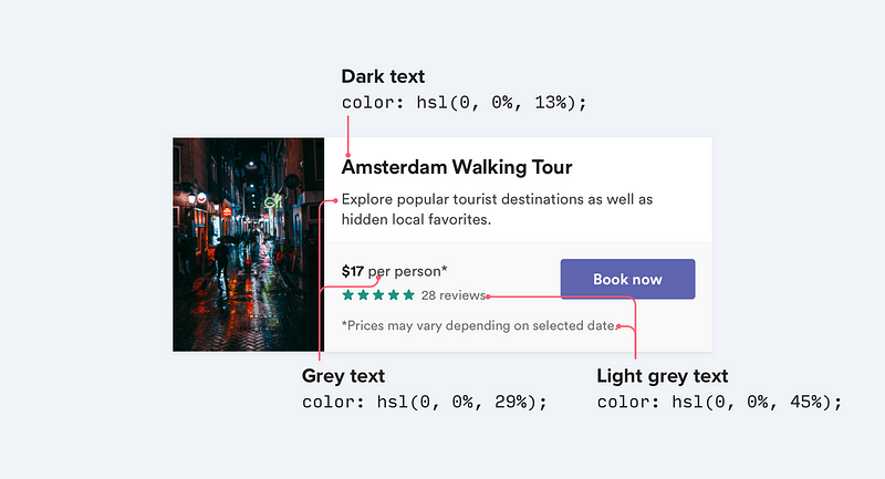
Try and stick to two or three colors:
- A dark (but not black) color for primary content (like the headline of an article)
- A grey for secondary content (like the date an article was published)
- A lighter grey for ancillary content (maybe the copyright notice in a footer)
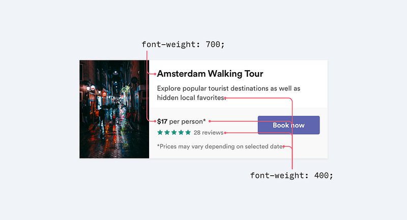
Similarly, two font weights is usually enough for UI work:
- A normal font weight (400 or 500 depending on the font) for most text
- A heavier font weight (600 or 700) for text you want to emphasize
Stay away from font weights under 400 for UI work; they can work for large headings but are too hard to read at smaller sizes. If you’re considering using a lighter weight to de-emphasize some text, use a lighter color or smaller font size instead.
2. Don’t use grey text on colored backgrounds
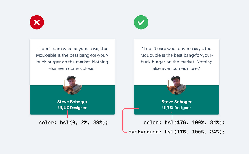
Making text a lighter grey is a great way to de-emphasize it on white backgrounds, but it doesn’t look so great on colored backgrounds.
That’s because the effect we’re actually seeing with grey on white is reduced contrast.
Making the text closer to the background color is what actually helps create hierarchy, not making it light grey.
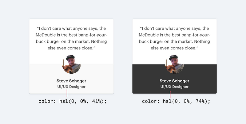
There are two ways you can reduce contrast when working with colorful backgrounds:
1. Reduce the opacity of white text
Use white text and lower the opacity. This lets the background color bleed through a bit, de-emphasizing the text in a way that doesn’t clash with the background.
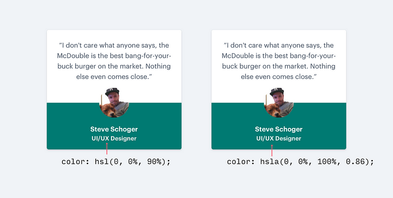
2. Hand-pick a color that’s based on the background color
This works better than reducing the opacity when your background is an image or pattern, or when reducing the opacity makes the text feel too dull or washed out.

Choose a color that’s the same hue as the background, adjusting saturation and lightness until it looks right to you.
3. Offset your shadows

Instead of using large blur and spread values to make box shadows more noticeable, add a vertical offset.
It looks a lot more natural because it simulates a light source shining down from above like we’re used to seeing in the real world.
This applies to inset shadows like you might use on wells or form inputs too:

If you’re interested in learning more about shadow design, the Material Design Guidelines are a fantastic primer.
4. Use fewer borders

When you need to create separation between two elements, try to resist immediately reaching for a border.
While borders are a great way to distinguish two elements from one another, they aren’t the only way, and using too many of them can make your design feel busy and cluttered.
The next time you find yourself reaching for a border, try one of these ideas instead:
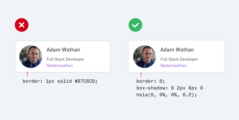
1. Use a box shadow
Box shadows do a great job of outlining an element like a border would, but can be more subtle and accomplish the same goal without being as distracting.
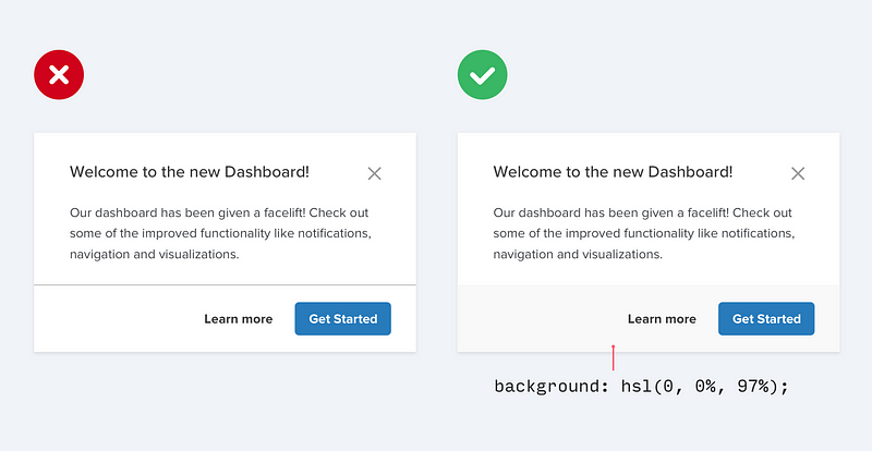
2. Use two different background colors
Giving adjacent elements slightly different background colors is usually all you need to create distinction between them. If you’re already using different background colors in addition to a border, try removing the border; you might not need it.
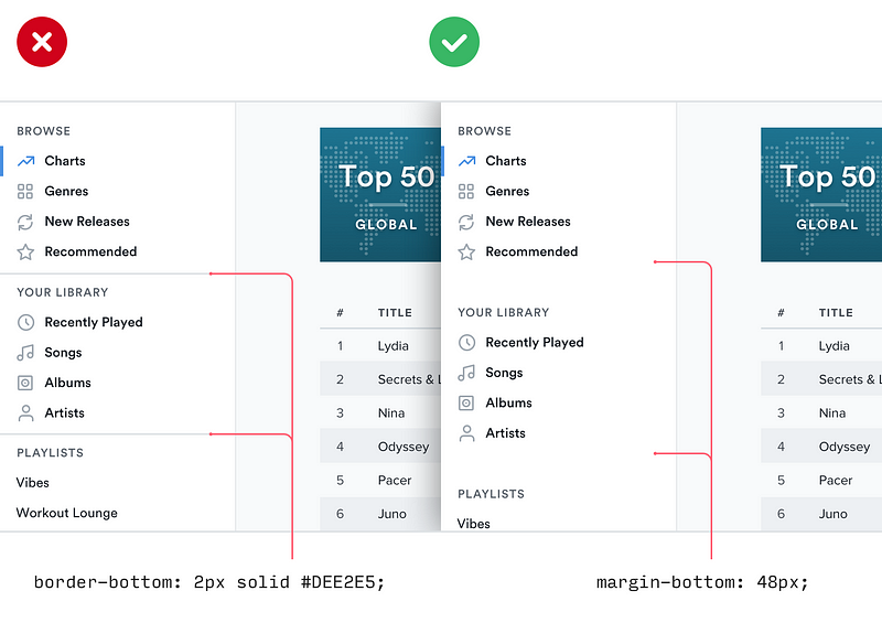
3. Add extra spacing
What better way to create separation between elements than to simply increase the separation? Spacing things further apart is a great way to create distinction between groups of elements without introducing any new UI at all.
5. Don’t blow up icons that are meant to be small
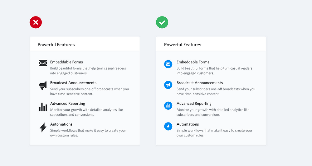
If you’re designing something that could use some large icons (like maybe the “features” section of a landing page), you might instinctively grab a free icon set like Font Awesome or Zondicons and bump up the size until they fit your needs.
They’re vector images after all, so the quality isn’t going to suffer if you increase the size right?
While it’s true that vector images won’t degrade in quality when you increase their size, icons that were drawn at 16–24px are never going to look very professional when you blow them up to 3x or 4x their intended size. They lack detail, and always feel disproportionately “chunky”.

If small icons are all you’ve got, try enclosing them inside another shape and giving the shape a background color:

6. Use accent borders to add color to a bland design
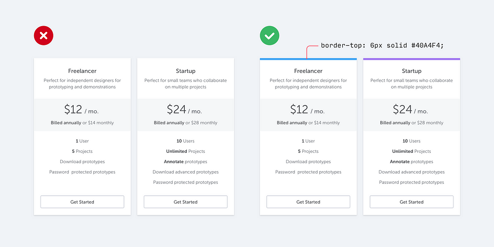
If you’re not a graphic designer, how do you add that dash of visual flair to your UI that other designs get from beautiful photography or colorful illustrations?
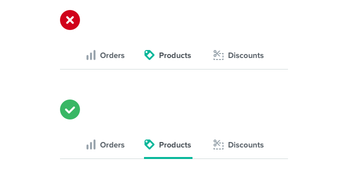
One simple trick that can make a big difference is to add colorful accent borders to parts of your interface that would otherwise feel a bit bland.
For example, along the side of an alert message:

…or to highlight active navigation items:
…or even across the top of your entire layout:

It doesn’t take any graphic design talent to add a colored rectangle to your UI, and it can go a long way towards making your site feel more “designed.”
Have a hard time picking colors? Try choosing from a constrained palette like Dribbble’s color search to avoid feeling overwhelmed by the endless possibilities of a traditional color picker.
7. Not every button needs a background color
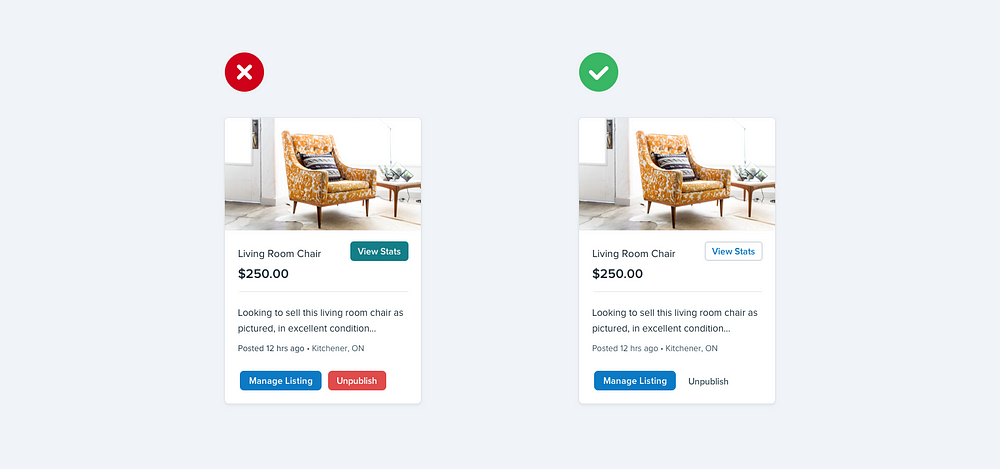
When there are multiple actions a user can take on a page, it’s easy to fall into the trap of designing those actions based purely on semantics.
Frameworks like Bootstrap sort of encourage this by giving you a menu of semantic styles to choose from whenever you’re adding a new button:
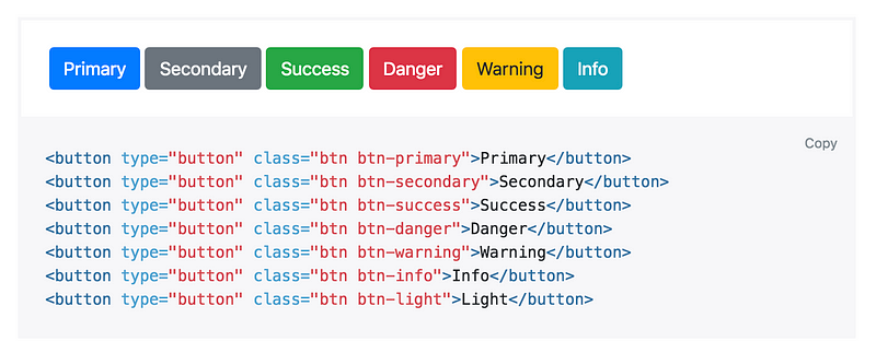
“Is this a positive action? Make the button green.”
“Does this delete data? Make the button red.”
Semantics are an important part of button design, but there’s a more important dimension that’s commonly forgotten: hierarchy.
Every action on a page sits somewhere in a pyramid of importance. Most pages only have one true primary action, a couple of less important secondary actions, and a few seldom used tertiary actions.
When designing these actions, it’s important to communicate their place in the hierarchy.
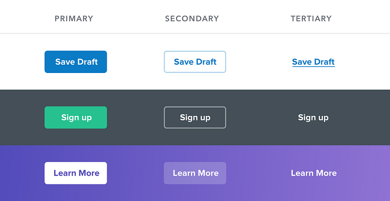
- Primary actions should be obvious. Solid, high contrast background colors work great here.
- Secondary actions should be clear but not prominent. Outline styles or lower contrast background colors are great options.
- Tertiary actions should be discoverable but unobtrusive. Styling these actions like links is usually the best approach.
“What about destructive actions, shouldn’t they always be red?”
Not necessarily! If the destructive action isn’t the primary action on the page, it might be better to give it a secondary or tertiary button treatment.
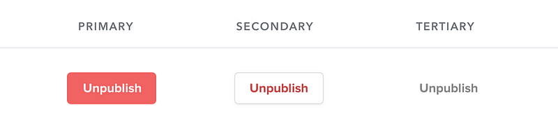
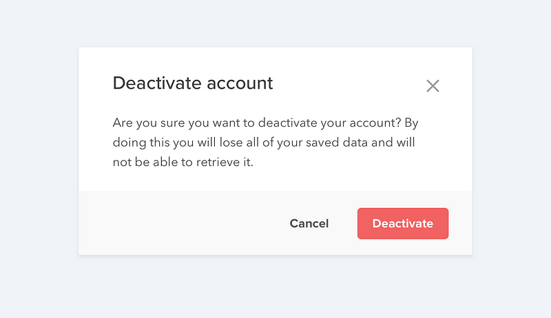
Save the big, red, and bold styling for when that negative action actually is the primary action in the interface, like in a confirmation dialog: